← All projectsFamily Business // Brand, Signage & Web
Paramore Real Estate
Rebranding my father’s real estate business in Burns, Oregon, from black and red that vanished into the landscape to an orange you can spot from down the street.
The rebrand
Visible from down the street.
I designed the original logo for my father in 2010, as a design student. By 2018 the black-and-red brand was blending into the landscape, so we rebuilt it around a bright orange and a new mark. The site followed: WordPress then, a custom Wix CMS in 2023. Now you can look down a street and tell instantly which homes are for sale.
[Before: the 2010 black-and-red brand]

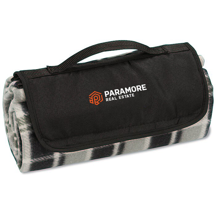
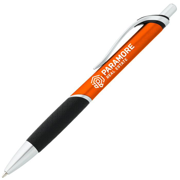
Brand in the world
[Website screenshot: 2023 Wix rebuild]