Mutual
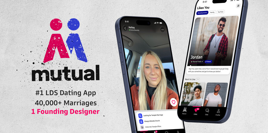
Ten years as the sole founding designer of Mutual, the #1 LDS dating app, responsible for 40,000+ marriages and counting.
A dating app for LDS singles where the product is other people, and half-finished, unverified profiles made it worse for everyone.
Co-founder and the only designer for ten years: UI, brand, design system, and research, across iOS, Android and web.
The #1 LDS dating app and 40,000+ marriages. A rebuilt onboarding where 97% finished their whole profile in testing.
- Every product surface, end to end, on iOS, Android and web
- Brand identity, and later a second brand for Ark
- The design system: three brands, six themes, semantic tokens
- Product and user research, including the onboarding tests
- A large part of product direction and strategy
- [Engineering: who built and shipped the apps]
- [Co-founders: business, growth, operations]
- [Anyone who helped run the in-person research]
Part-time from day one, full-time since 2021. Design direction for a company of about 30 across two shipping products. [One line on how you worked with engineering, e.g. how handoff or pairing ran.]
Ten years. One designer.
Co-founder and sole founding designer of Mutual, the #1 LDS dating app in the world. Grew it from a scrappy startup into a multi-million-dollar business. Part-time from day one, full-time since 2021.
Ten years as the only designer in the company. Owned every surface end-to-end: UI, product and user research, design system, brand identity. Greatly involved in product direction, strategy, and success.
Responsible for 40,000+ marriages and counting. Humbling, and fills me with joy.
Giving people an exit.
Signing up meant one long form, then getting bounced around the app to add photos. Plenty of people never finished. That is a real problem when the product is other people: a half-empty profile is a worse experience for everyone who sees it, and an unverified one gives nobody peace of mind.
The risk in asking for more was form fatigue. Ask for too much, get less.
A stepped flow, not one long form
- Options
- Keep the single long form, then send people around the app to add photos; or break signup into steps with a progress timeline across the top.
- Why
- Plenty of people never finished the long form, and a half-empty profile is a worse experience for everyone who sees it.
- Trade-off
- More screens to get through, and asking for more risks form fatigue: ask for too much, get less.
Make the exit deliberate and visible
- Options
- Require every field before entering the app; or, once the required basics are in, show a button beside the timeline that skips straight to the app.
- Why
- [Why a visible exit, in your words.] The exit is deliberate, and impossible to miss.
- Trade-off
- [Draft: the risk that people skip and leave thin profiles.] In testing, almost nobody took it: 97% finished the whole profile.
Test two flows in person
- Options
- [What else was considered: remote tests, an A/B test in production, shipping one flow and watching analytics.]
- Why
- We took over a local waffle place and traded free waffles for time with the app. My part was testing two onboarding flows against each other, both built from research into how other apps handle the same moment.
- Trade-off
- [What you gave up: sample size, one location, a self-selected crowd.]
Fold verification into signup
- Options
- Leave verification as a separate step people find later; or make it part of the onboarding flow.
- Why
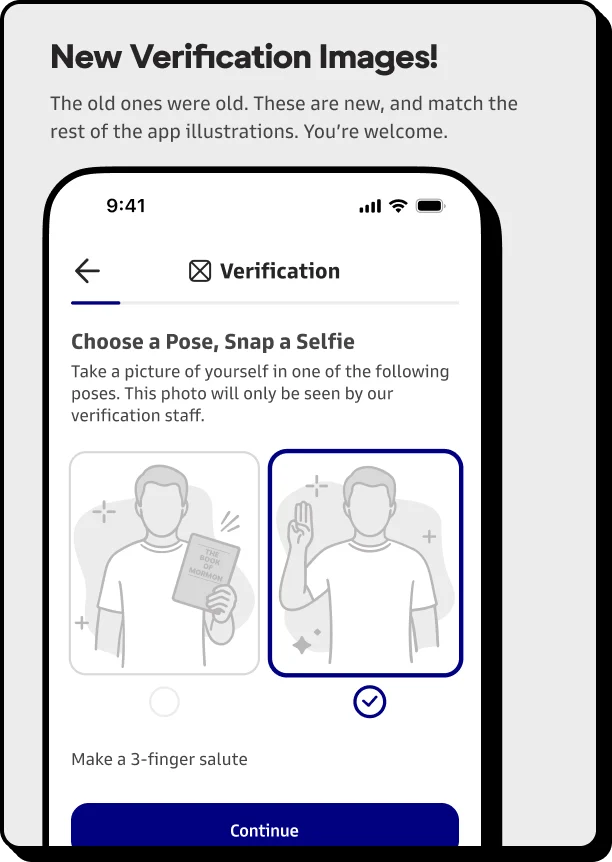
- An unverified profile gives nobody peace of mind. About 80% completed verification once it was in the flow.
- Trade-off
- [One more step at the most fragile moment of signup; say how you kept it from costing completions.]
Concept to ship.
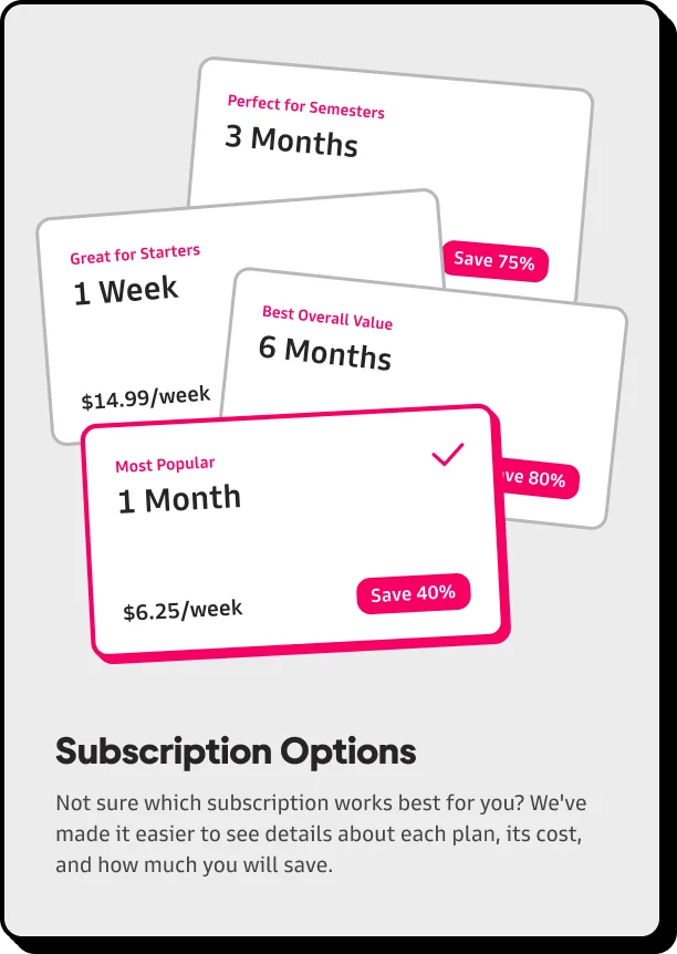
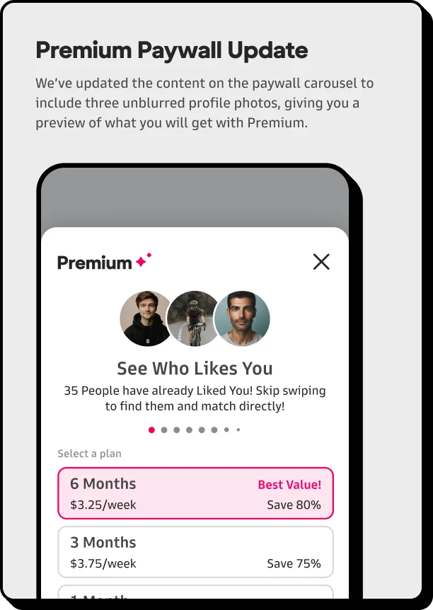
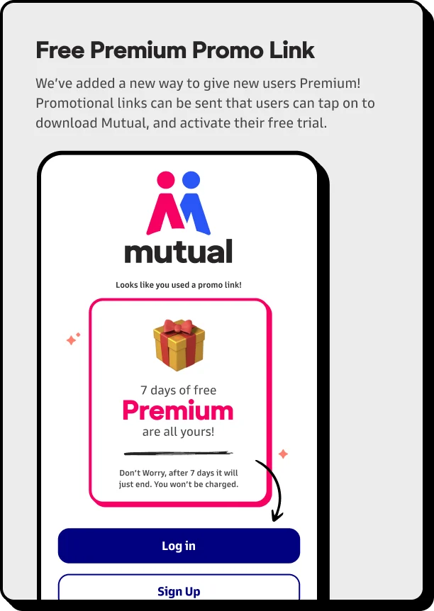
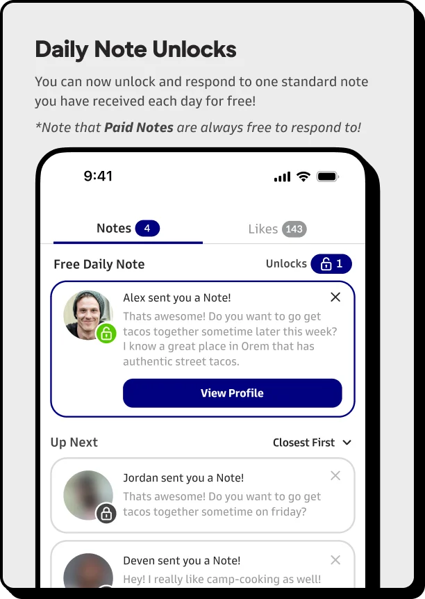
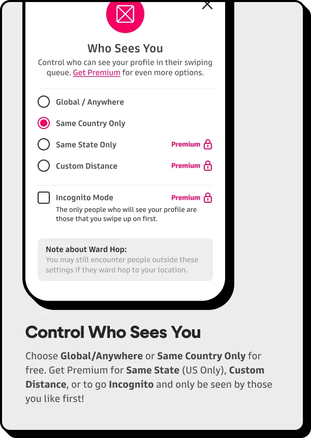
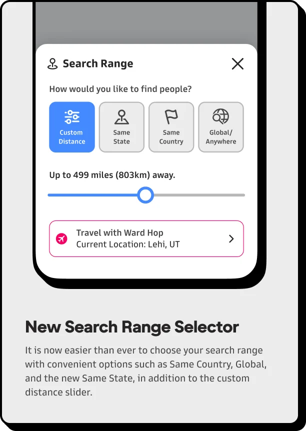
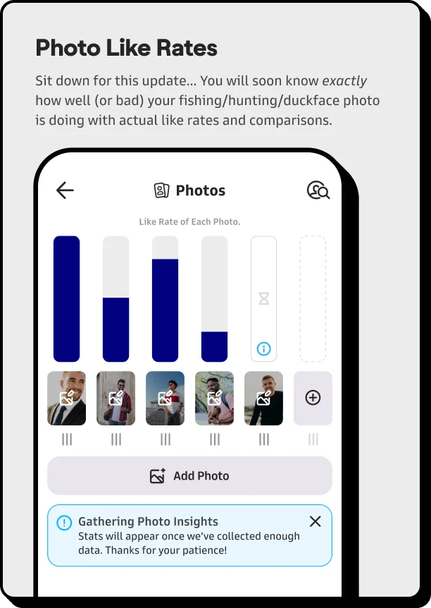
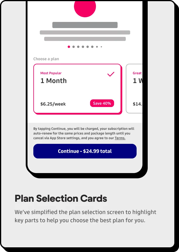
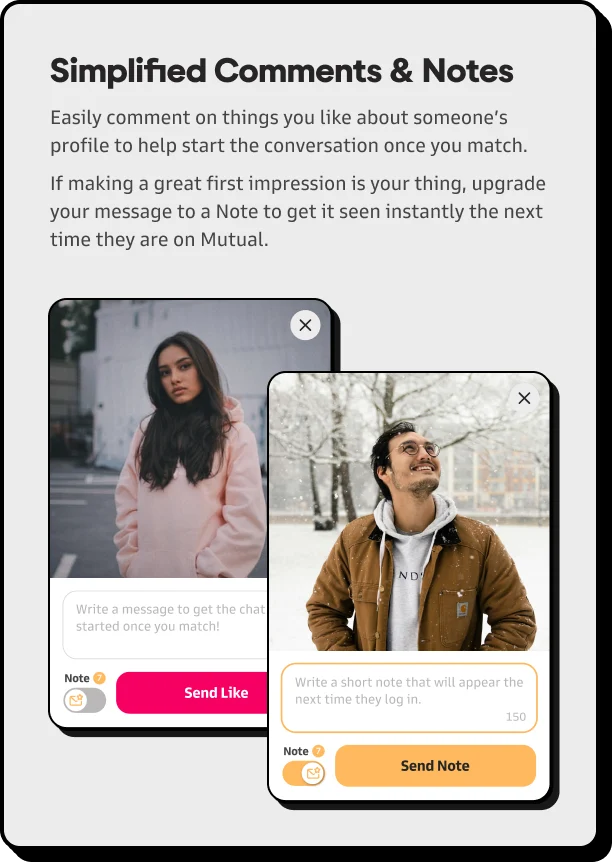
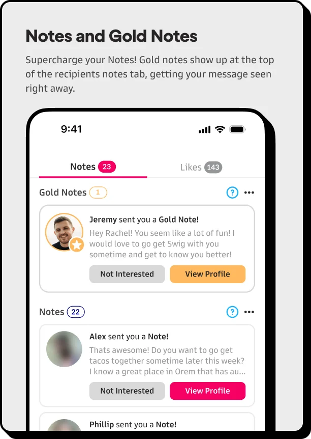
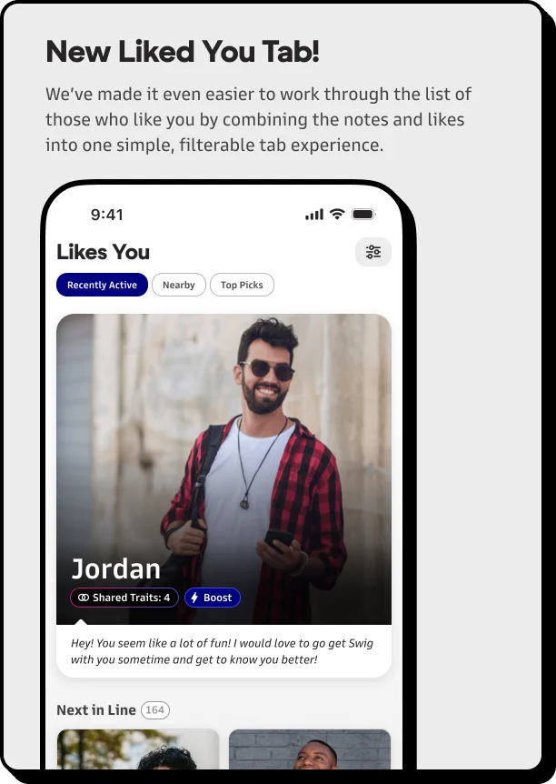
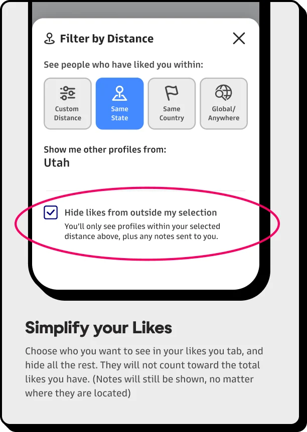
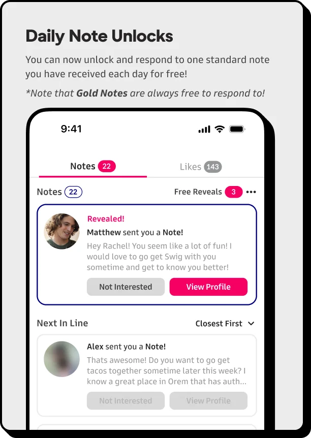
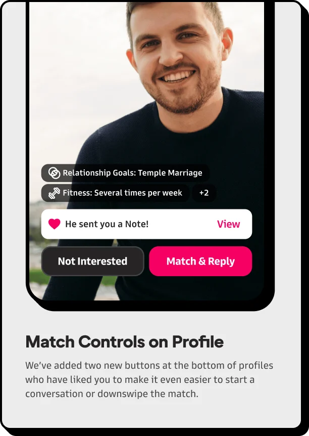
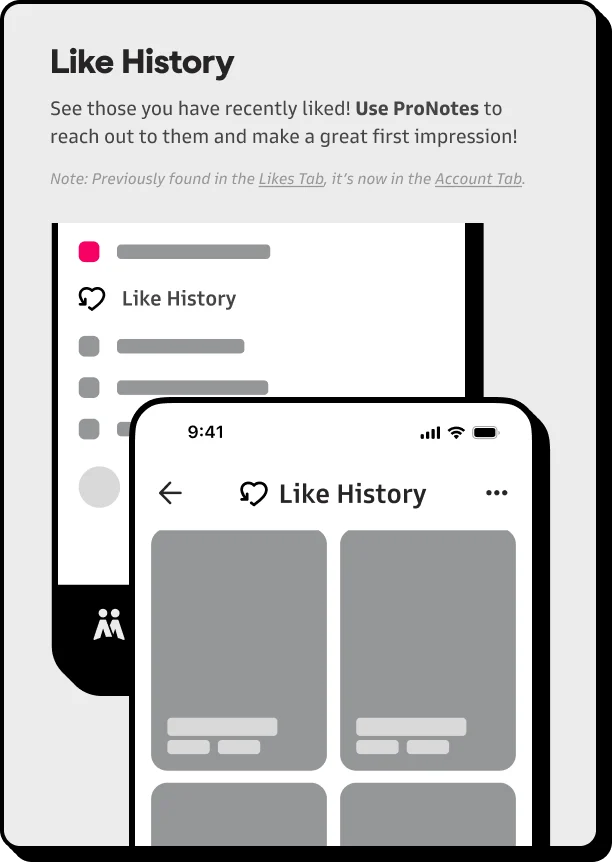
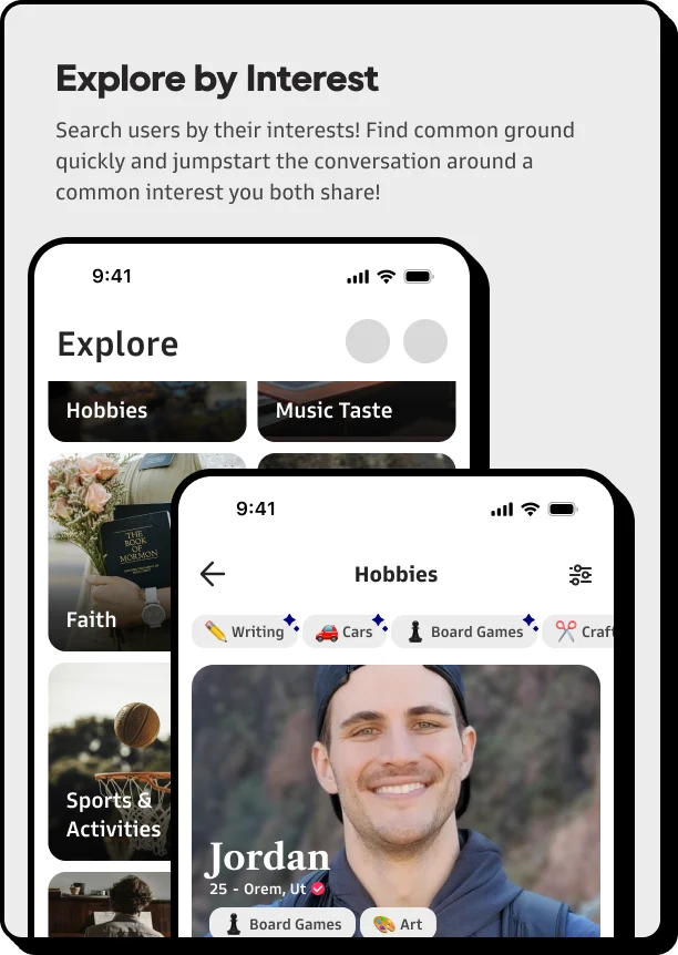
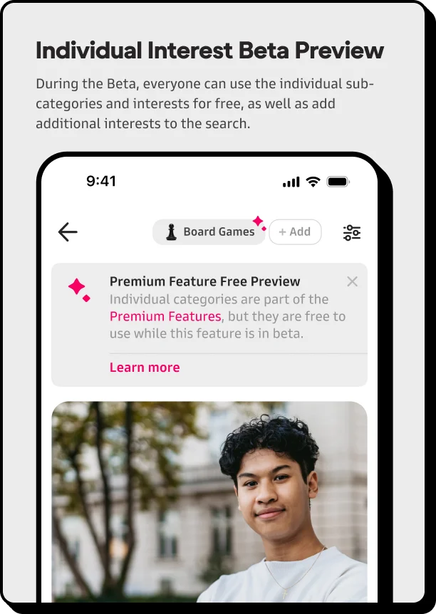
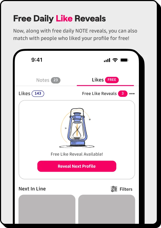
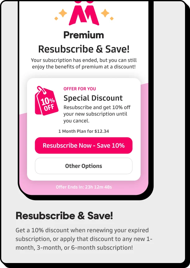
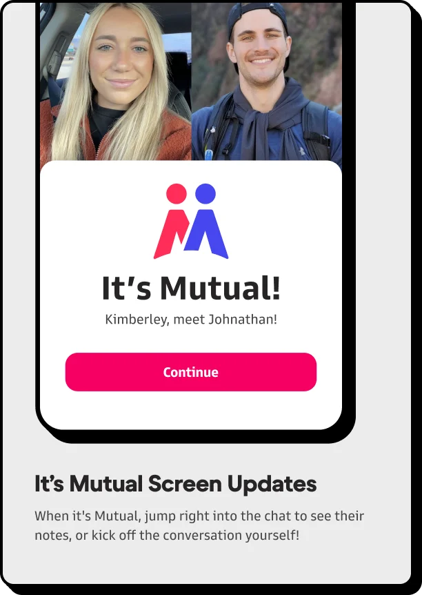
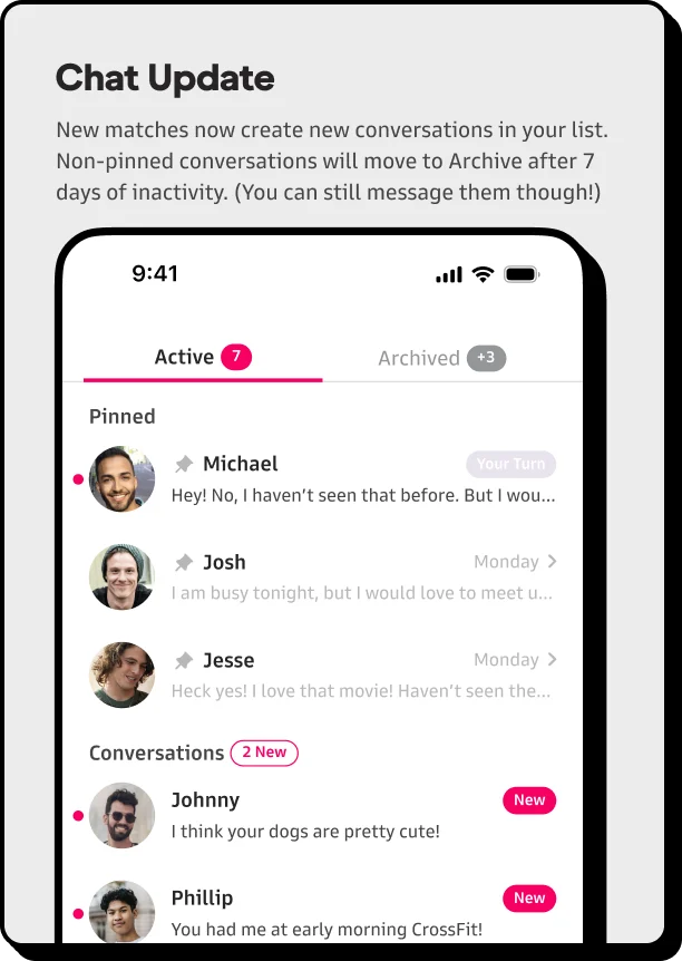
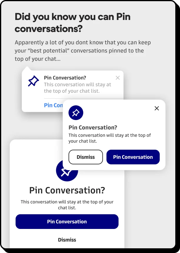
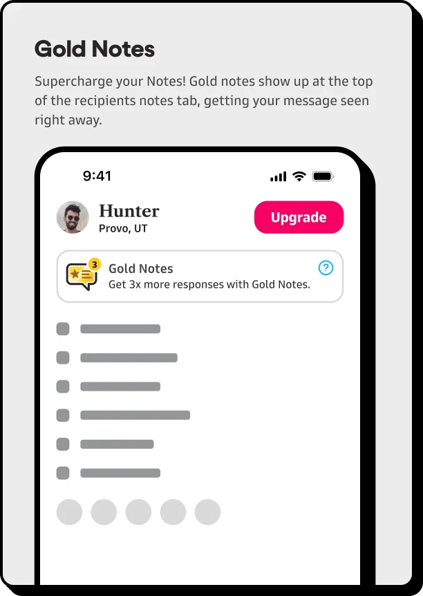
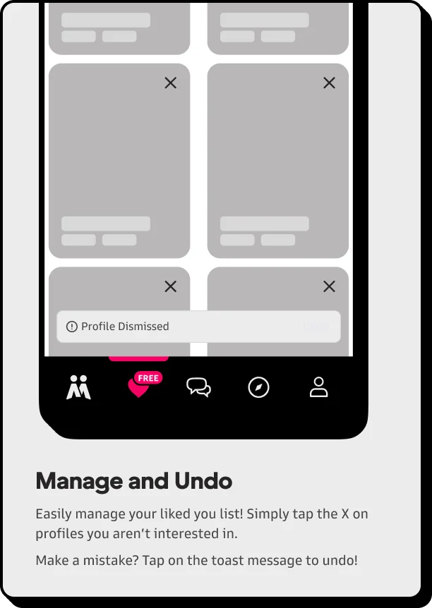
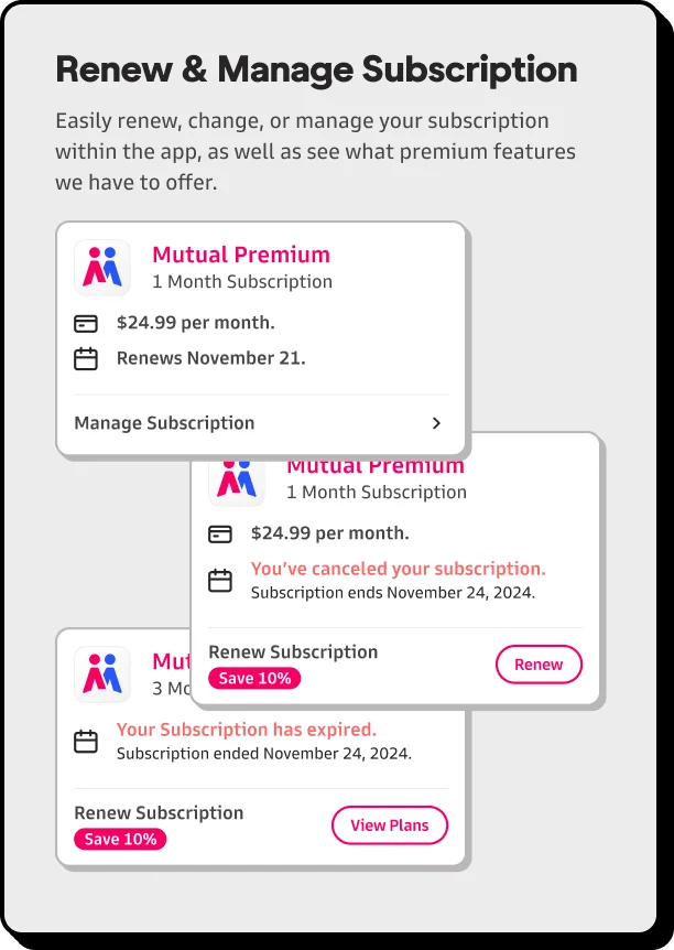
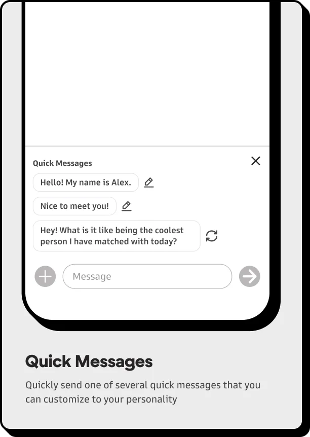
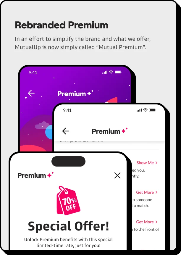
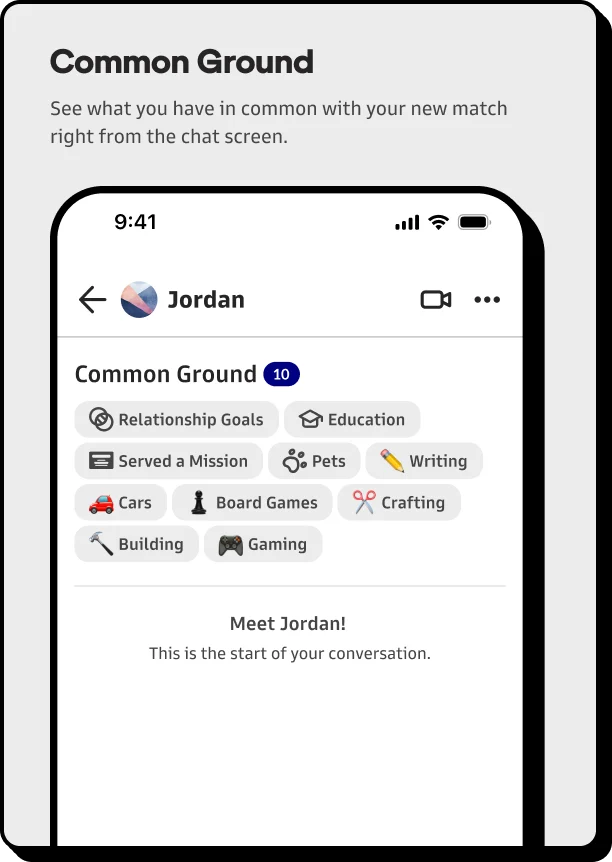
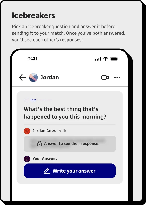
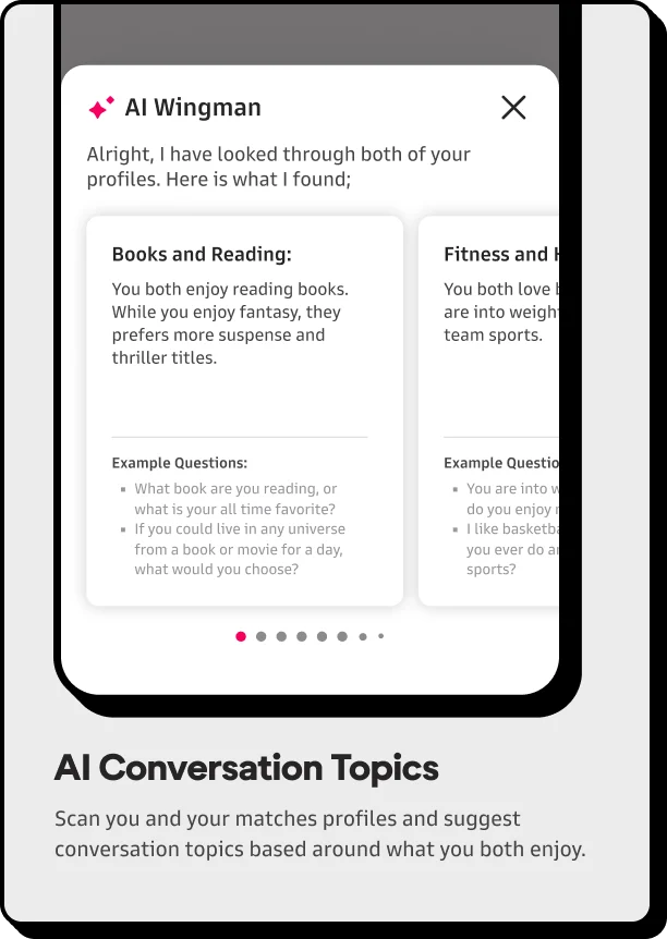
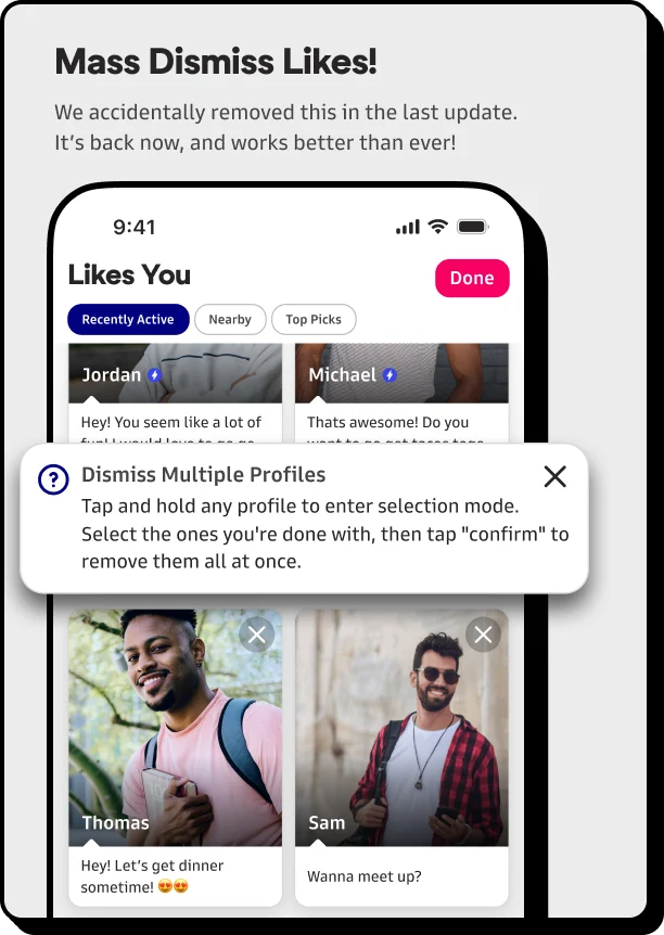
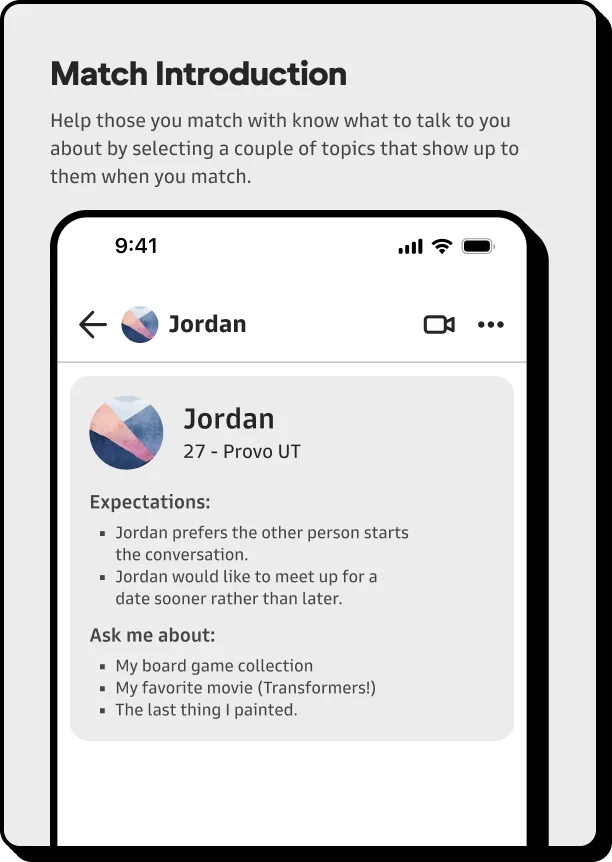
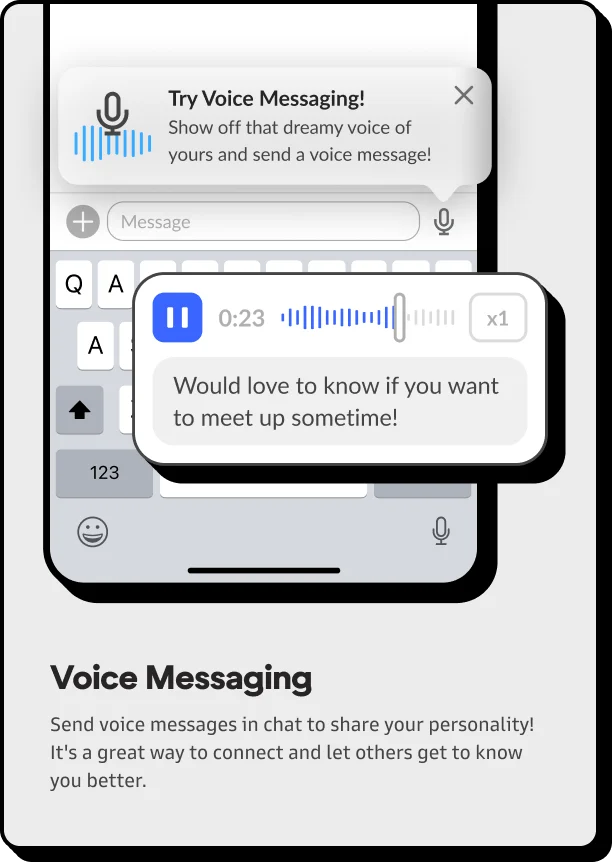
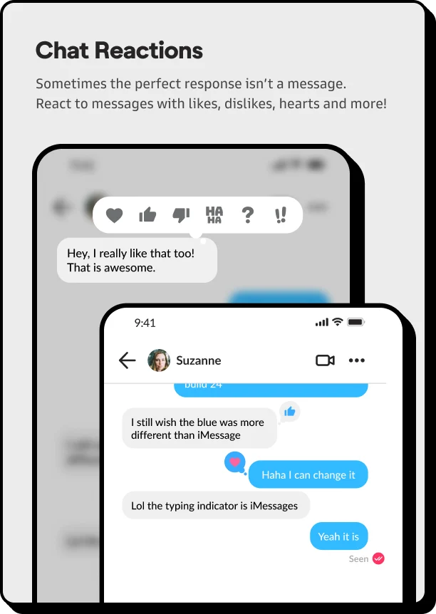
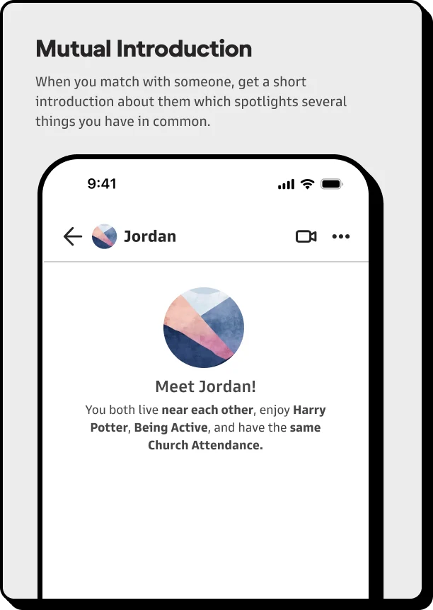
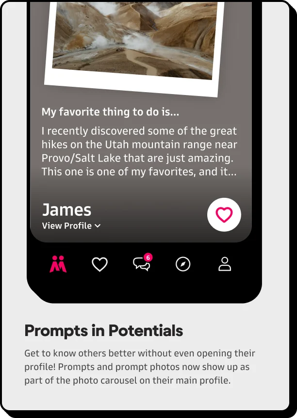
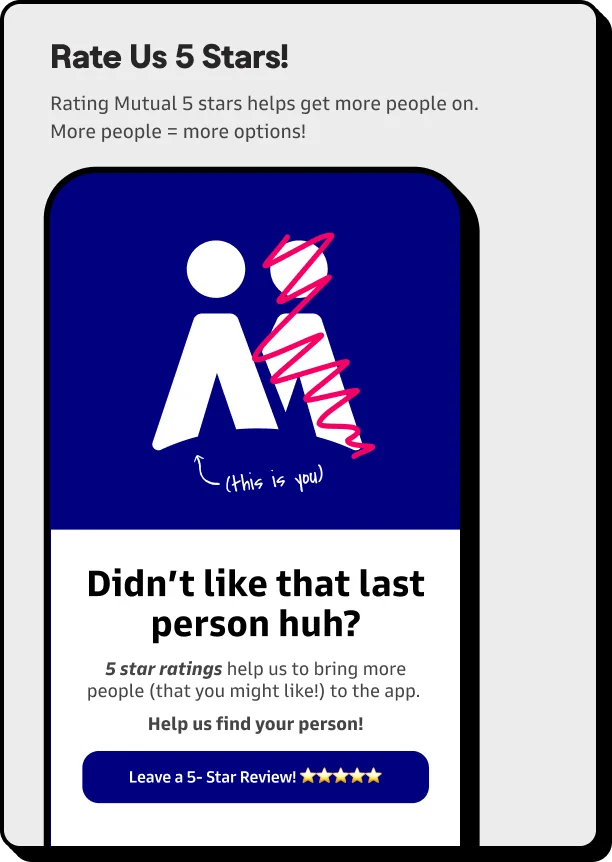
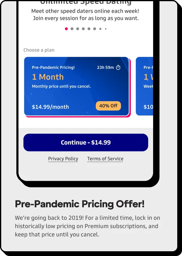
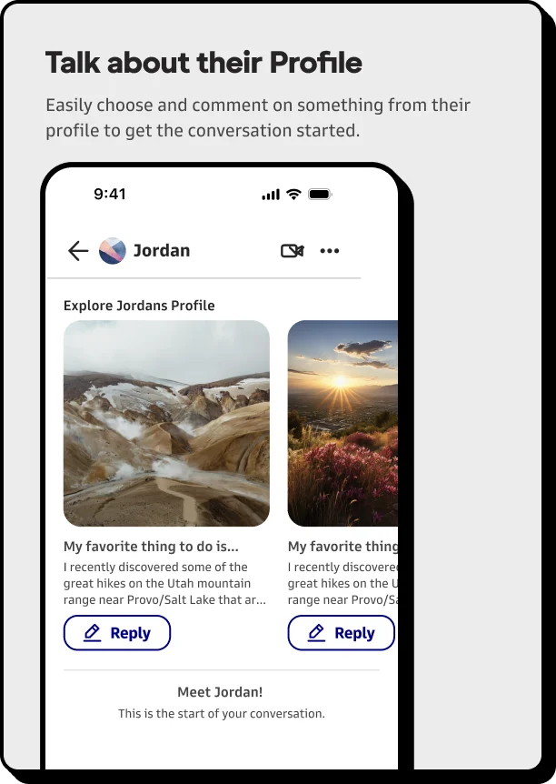
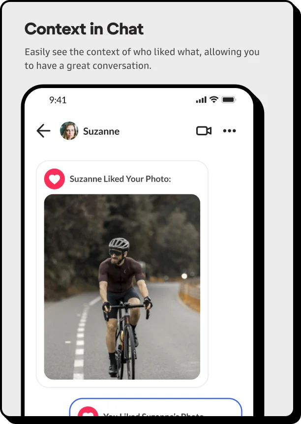
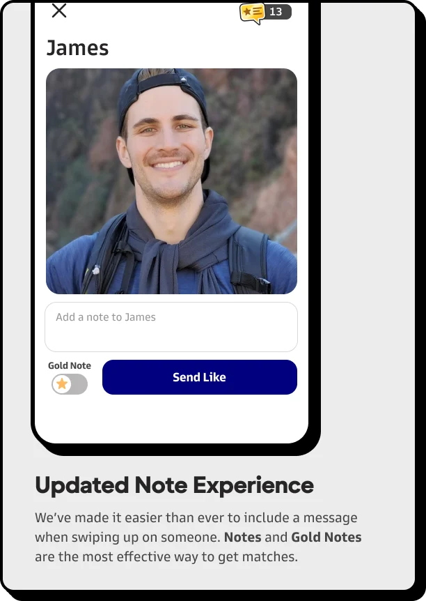
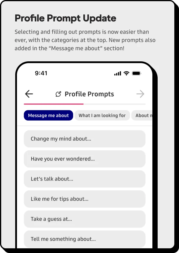
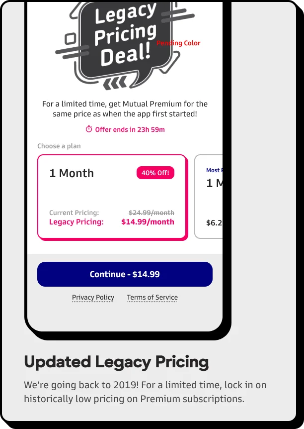
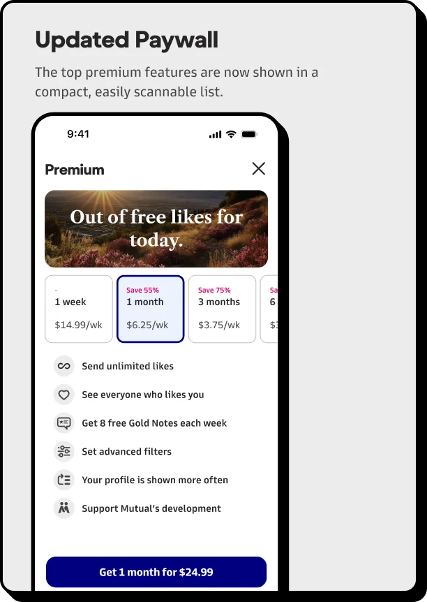
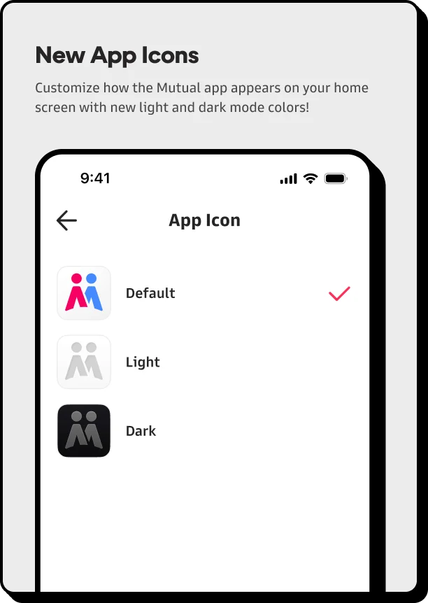
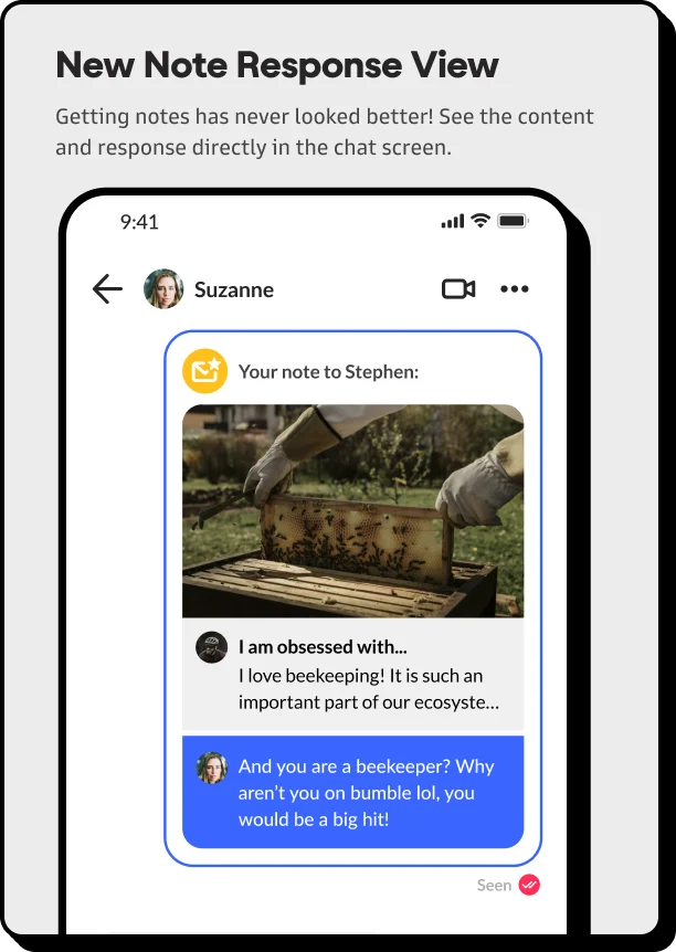
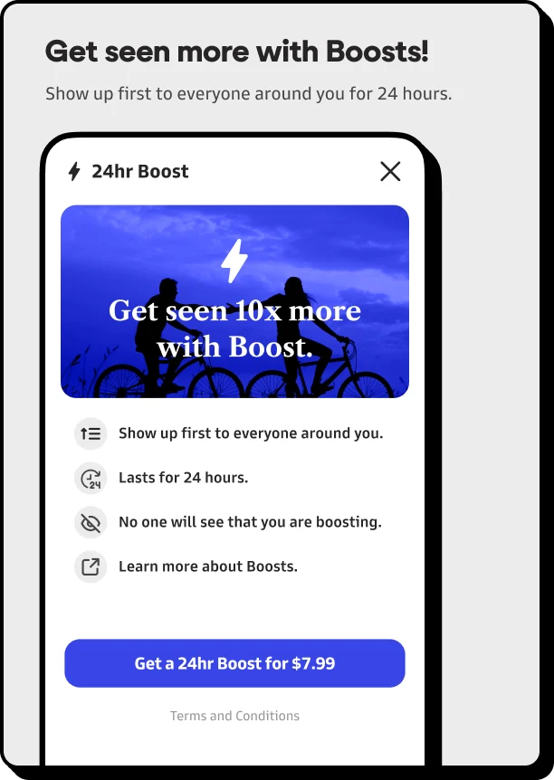
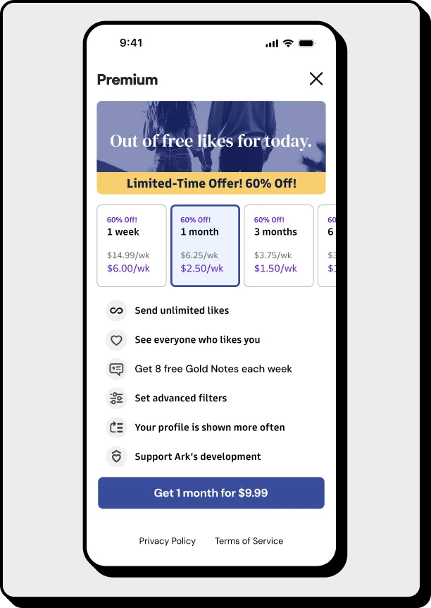
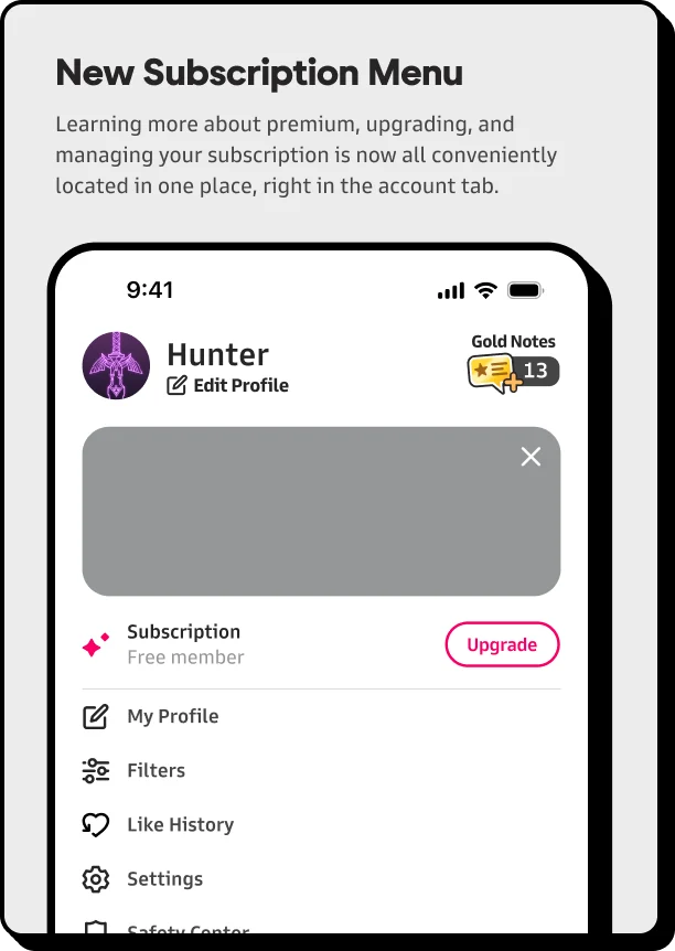
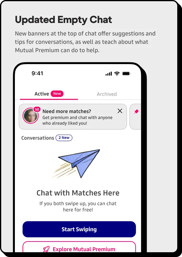
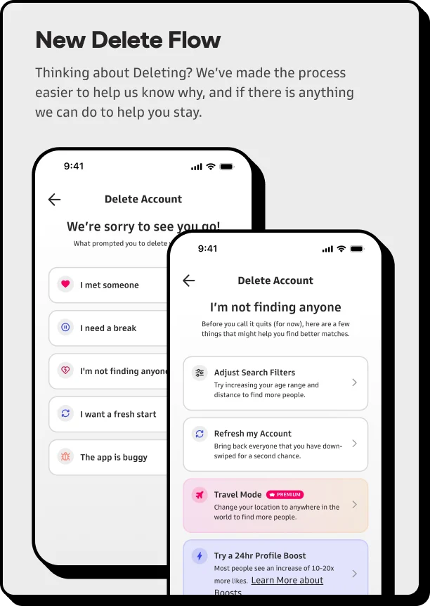
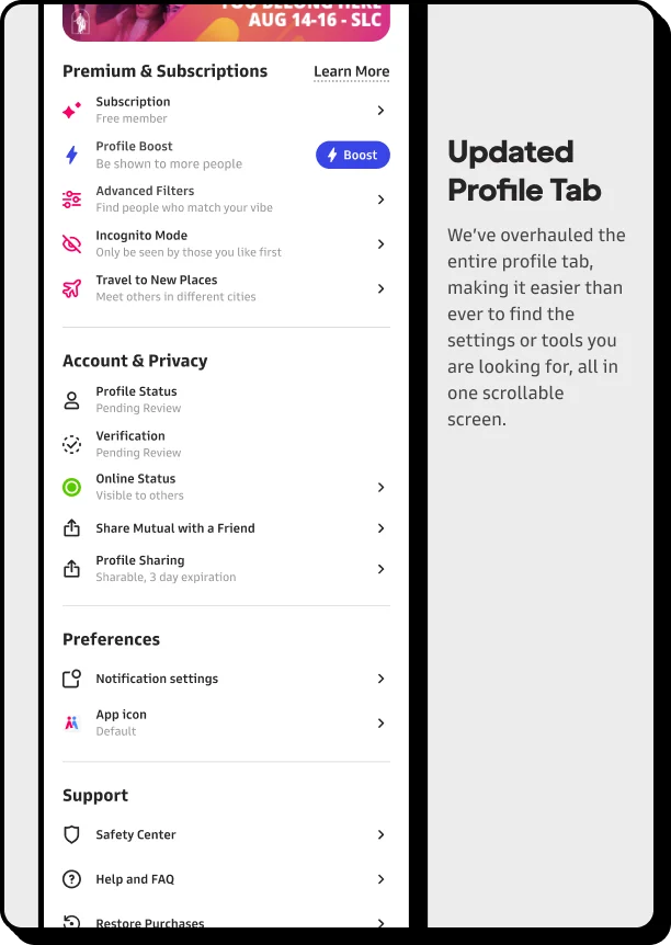
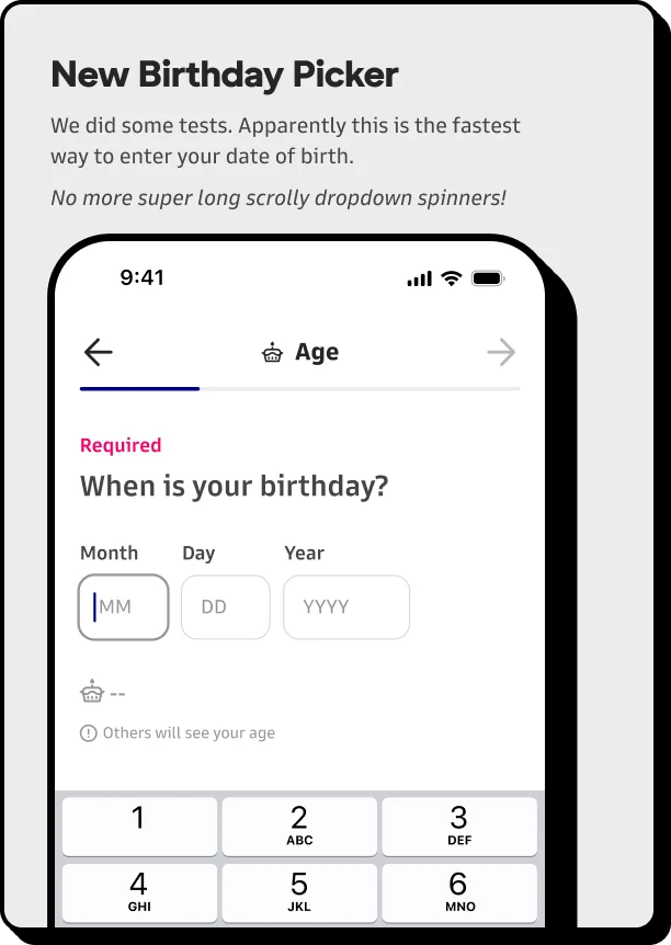
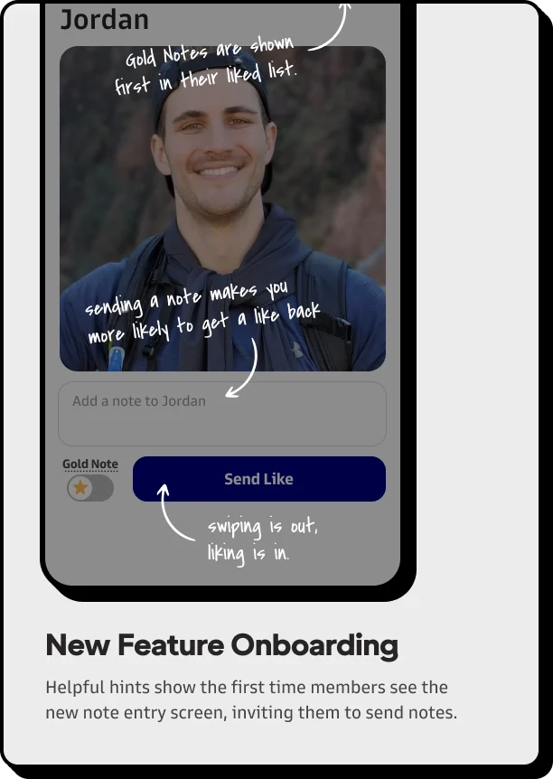
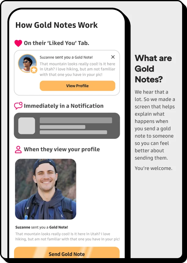
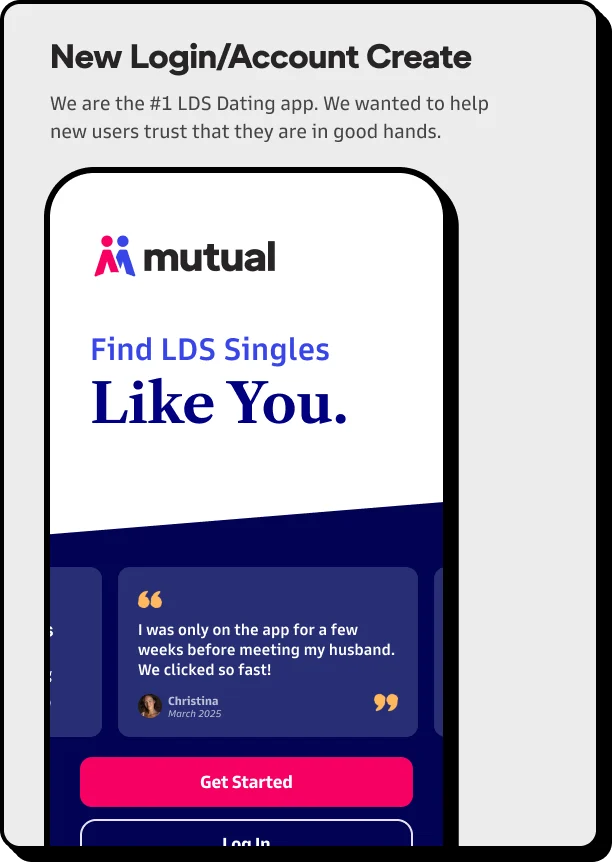
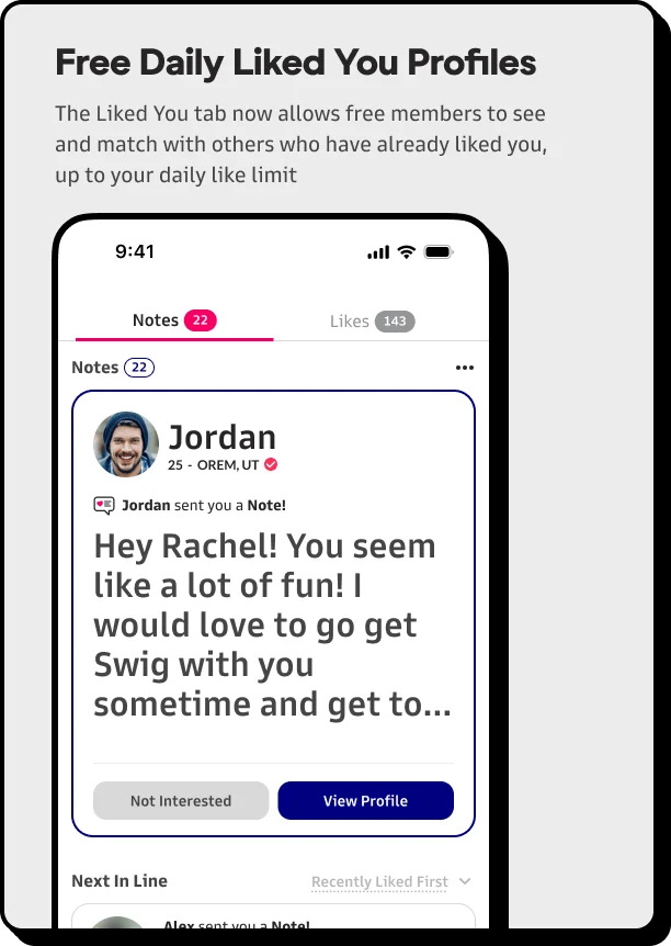
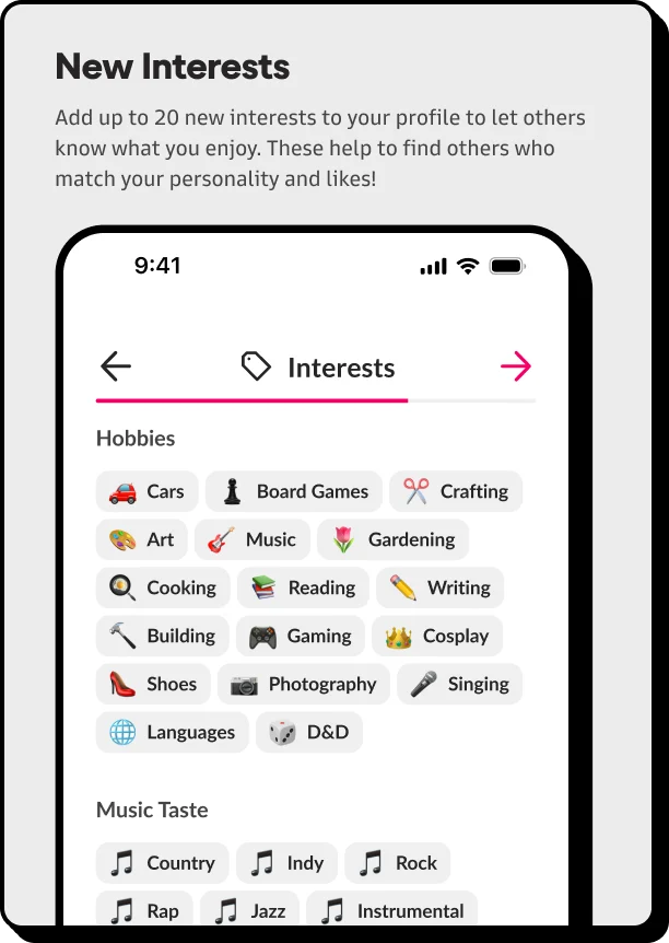
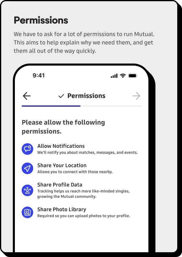
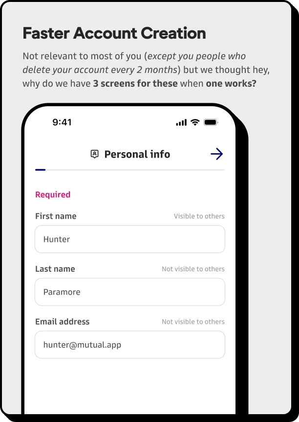
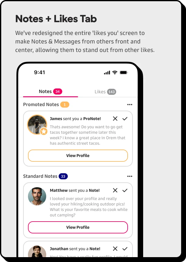
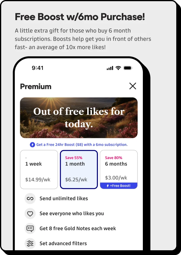
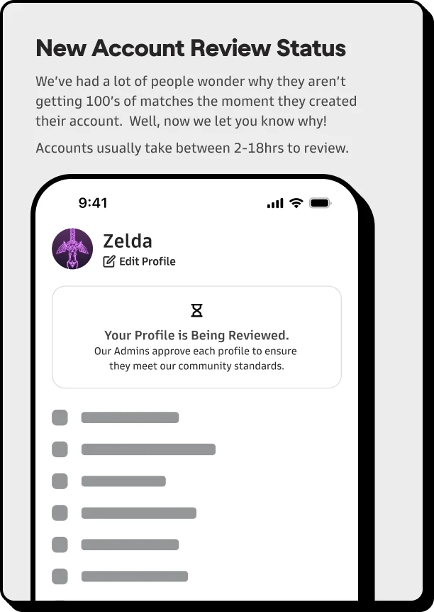
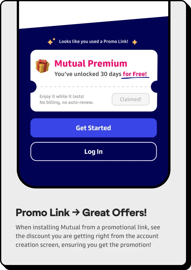
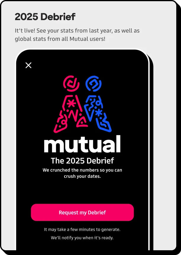
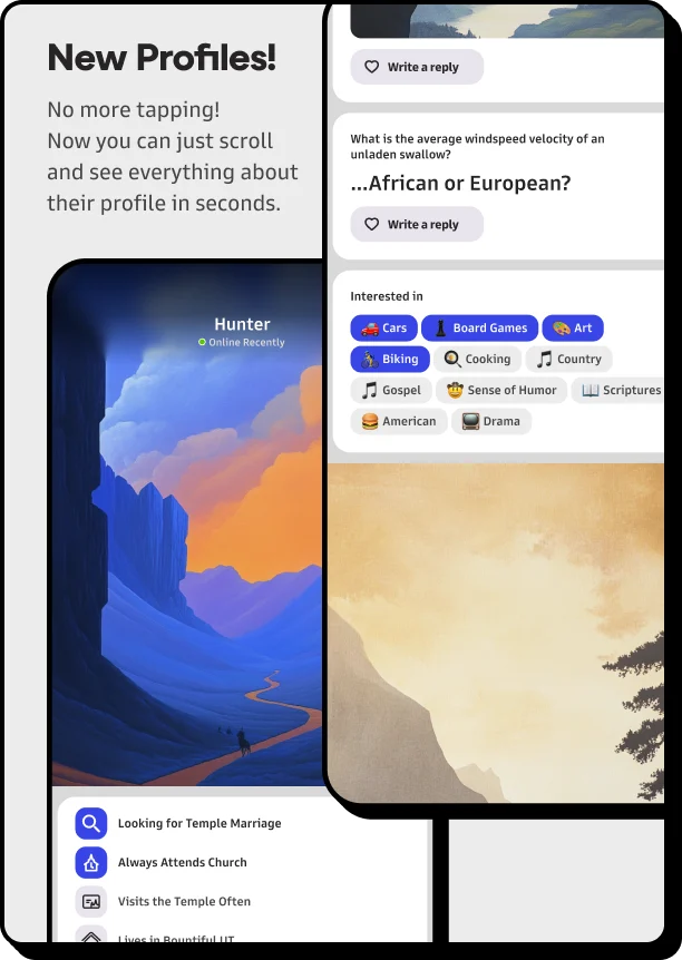
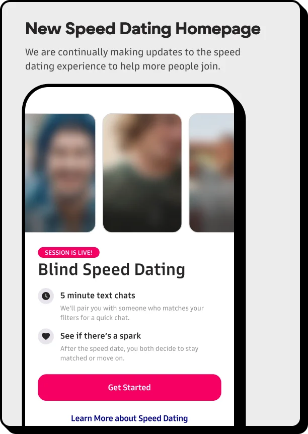
A slice of the last year and a half of work at Mutual: feature concepts, A/B tests, prototypes, and shipped releases. Each thumbnail represents a complete Figma page behind it: dev-ready flows, design system updates, and the supporting work that made it real.
Most shipped. Some are still v1s waiting on a v2. A few stayed prototypes that didn’t make it past testing. Each one started as an idea I shaped into something concrete enough to put in front of people and talk about.
What I’d do differently
[One honest answer: a decision above you’d now make the other way, or something you’d measure earlier. This is the question an interviewer will ask; answer it first.]
And that’s just the last 18 months.
Ten years of this: every login screen, empty state, paywall, illustration, A/B test, and brand refresh. If you’re curious about any of it, I’d love to talk.