Mutual Design System
One token layer. Three brands. Six themes. A system structured so engineers and AI agents can build correct, on-brand, accessible UI from one source.
Open the live system →Two shipping dating apps, Mutual and Ark, run off parallel clones of one codebase, plus a third concept brand.
I built the system: the token architecture, every theme, the components, live contrast checks, and the explorer.
Every brand and mode generates from one semantic layer, and an engineer or AI agent can build on-brand UI without me in the loop.
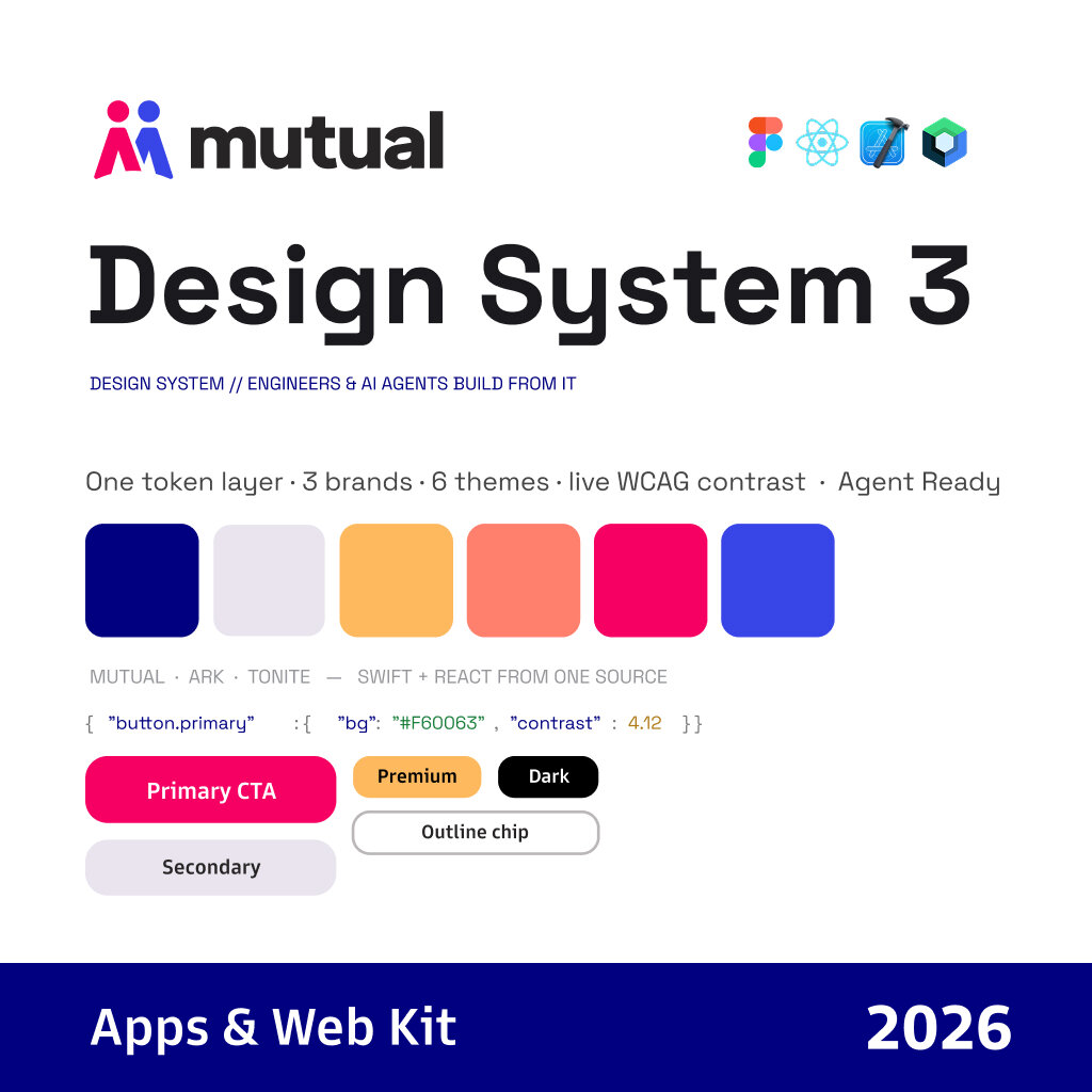
- The semantic token layer and how brands and modes map onto it
- Three brands, each in light and dark: six themes
- Type ramps, color, and components rendered live from tokens
- Live WCAG contrast checking inside the system
- The explorer, its AI view, and the agent hand-off prompt
- [Engineers who consume the Swift and React exports]
- [Who decided to run Ark off the same codebase]
[One line on how engineering adopted it: what changed in their workflow once the tokens shipped.]
Not pretty. Structured.
Every color, type ramp, and component in the explorer is rendered live from the tokens. Flip the brand and mode switches and the entire page re-themes from one source of truth. The point is that a new engineer, or an AI agent, can read these tokens and assemble correct, on-brand, accessible UI without me in the loop.
One semantic layer for every brand
- Options
- Separate style files per brand; or one semantic token layer that every brand and mode maps onto.
- Why
- Two products already ran on parallel clones of one codebase. One layer meant a brand or mode switch re-themes everything, and the tokens export cleanly to Swift and React.
- Trade-off
- [What the abstraction cost: e.g. semantic names take longer to learn than raw values.]
Check contrast while designing
- Options
- Audit accessibility after the fact; or build WCAG contrast checking into the system itself.
- Why
- Accessibility problems show up while you’re designing instead of in an audit months later.
- Trade-off
- [Where passing contrast constrained a brand’s palette, and how you resolved it.]
Write it for AI agents, too
- Options
- Documentation for people only; or tokens and rules an agent can read directly, plus a prompt that scaffolds the whole system into a repo.
- Why
- Paste the prompt into Claude, Cursor, or any coding agent, say what to build, and it builds using only that system: on-brand and accessible by default. The explorer’s AI view shows exactly which token an agent reads for each element.
- Trade-off
- [The rules had to be explicit enough for a machine. What did writing them that way cost, or teach you?]
What I’d do differently
[One honest answer: a token-naming choice, a component boundary, or an adoption step you’d change.]